Home › Forums › Themes Support › Gecko › Single column product listing on mobile and desktop
Tagged: wpbakery
- This topic has 7 replies, 2 voices, and was last updated 7 years, 3 months ago by
 patrickmarmalade.
-
AuthorPosts
-
-
March 12, 2018 at 3:26 pm #18039
Hello,
I am trying to set up a product listing page that is 1 column on mobile
and 2 columns on desktop.
Issues:
- (wpbakery element: product/ producsts) Minimum column dropdown is allowed to be displayed is 2.
- (wpbakery element: product) When trying to add 1 product on a row, on mobile it looks like it does not use the whole width of the device (the product seems to only use less than 50% of the screen width)
Is there a css change that can make single column possible, and make the products look full width ?
-
March 12, 2018 at 11:44 pm #18053
Hi,
Please setup 2 products a row on desktop and use below code to set 1 column of product on mobile
Add below code to JanStudio > Theme Option > General Layout > Custom CSS
@media only screen and (max-width: 736px) {
.products .jas-col-xs-12 {
	flex-basis: 100% !important;
	max-width: 100% !important;
}}
Best regards
Best regardsHarry
Premium Wordpress themes and plugins, Best WooCommerce theme https://themeforest.net/user/janstudio/portfolio?ref=janstudio -
March 17, 2018 at 5:00 am #18273
Thanks I’ll test this tonight!
-
March 20, 2018 at 5:08 pm #18339This reply has been marked as private.
-
March 20, 2018 at 10:52 pm #18351
Hi,
This is custom page, you have to edit element of products http://take.ms/zuvgc
Best regards
Harry
Premium Wordpress themes and plugins, Best WooCommerce theme https://themeforest.net/user/janstudio/portfolio?ref=janstudio -
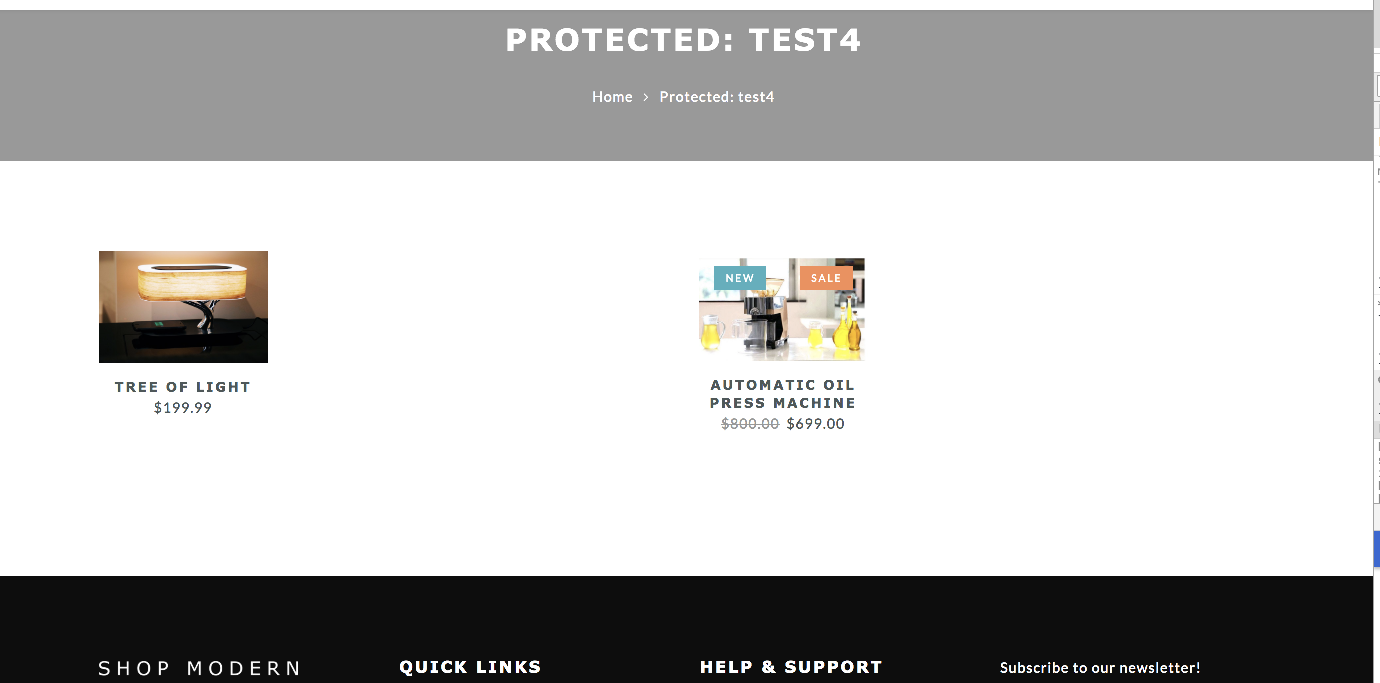
March 20, 2018 at 11:44 pm #18357
Thanks for the screenshot however it does not resolve my issue.
The screenshot I sent shows that the product (and not “products”) element is being squeezed inside the column
This is the layout I need to use:
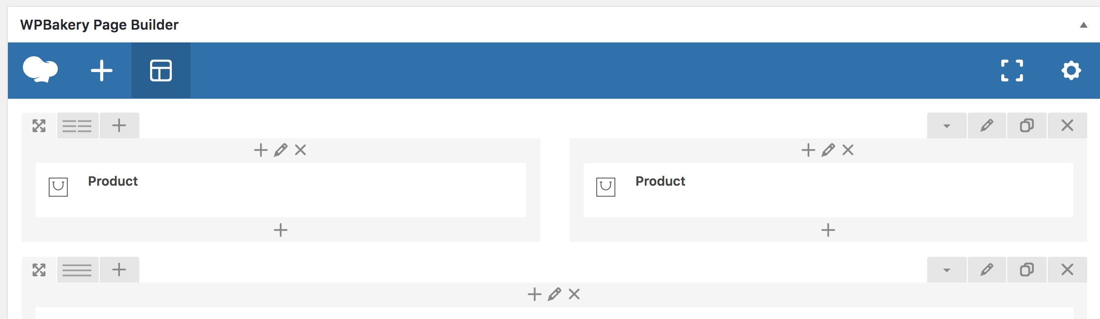
This is the result:
>>The single ‘product’ needs to be scaled up to use 100% of the column width. I’m not able to target the product element to get the effect of using 100% width /w vertical scale to aspect ratio in my css attempts..
-
March 21, 2018 at 10:06 am #18375
Hi,
Please add below code to JanStudio > Theme Option > General Layout > Custom CSS
.jas-col-md-0 {
	flex-basis: 100% !important;
	max-width: 100%  !important;
	-webkit-flex-basis: 100%  !important;
	-ms-flex-preferred-size: 100%  !important;
}
Best regards
Harry
Premium Wordpress themes and plugins, Best WooCommerce theme https://themeforest.net/user/janstudio/portfolio?ref=janstudio -
March 22, 2018 at 2:27 pm #18421
Awesome!! that worked!!
Thanks for the help!
-
-
AuthorPosts
You must be logged in to reply to this topic.