Home › Forums › Themes Support › Claue › few problems, mobile menu
- This topic has 3 replies, 2 voices, and was last updated 6 years, 9 months ago by
 Harry.
-
AuthorPosts
-
-
October 3, 2018 at 4:15 pm #25327
1. After adding the product to the basket and pre-fetching immediately after the basket, a message that the product has been added to the basket is unnecessarily displayed. The next time I enter the basket, this message is gone. What zorbić that this message is not displayed in the basket. The customer already knows that the product has been added to the basket. Image – 1.jpg
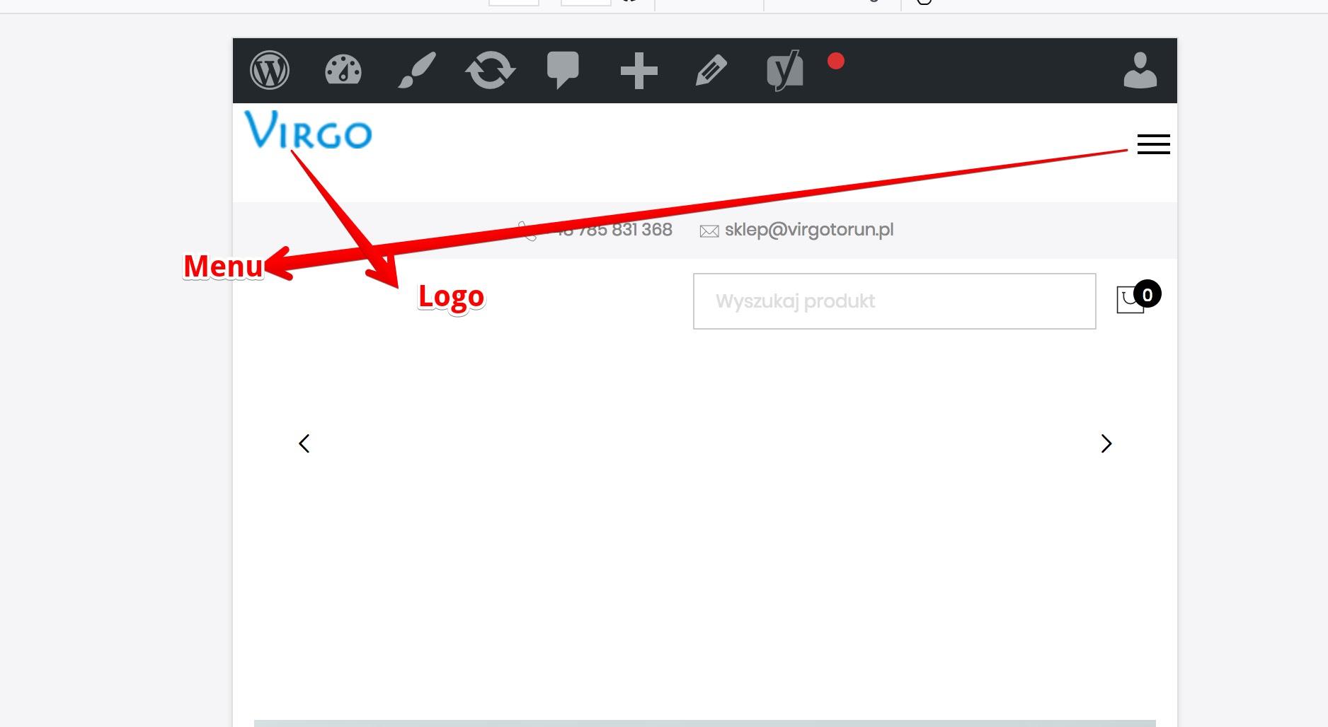
2. I would like to refine the mobile look of the website – 2.jpg
a) because I’m using the mega sub menu I would like to disable the mobile default menu but only if the screen is smaller than 1024px – how can you give me the code to style.css?
b) Another problem is the overlapping elements like the logo and the search element, it is not the default in the template, but could I ask you to move it higher or lower? The logo is also hidden behind the elements.
c) I would like the order to be the same as in the default template in codecanyon.
from the top
– menu in the upper right corner
– search
– logo
– the rest of the page
Site, not readable on the phone and please help me change it for the better
d) it is possible that I will enable the logo in the submenu menu – what code should I disable the “retina” logo only on mobile devices below 1024px?3. Too large space between visual composer and upper menu – 3.jpg
there is too much space between the slider and the menu. When I lift it with the help of a css, everything on the mobile device is dispersed, the elements overlap. How can I reduce the gap?4. The upper-main menu spacing
Video: https://drive.google.com/file/d/1zNJZdjAi6BZOA1tRFJU9JOmReUATcCKR/view?usp=sharing
I do not know if I can explain this correctly, I would like to delete the space between the links in the menu, between items. The idea is that if you move the mouse horizontally, the top menu is displayed all the time instead of blinking. On the film I will show how the competition is done.5. Runaway fourth position. Video: https://drive.google.com/file/d/1H84IpfoCuLKxR16I43BhhF0V4GgkeVin/view?usp=sharing
I reported this problem some time ago. The problem only occurs in the Chrome browser. Resolution 1920×1080. After entering the category, 4 products in a row are set by default. Unfortunately, after a moment of loading from four in a row, it gets three. What could be the reason?
Give you wordpress data or will you help me by writing the code?
Thank you in advance for your help.Attachments:
You must be logged in to view attached files. -
October 3, 2018 at 5:46 pm #25337
Hi,
1. Please try go to WooCommerce > Settings > Products > General > Add to cart behavior and uncheck 2 last fields
2.
a. Please add below code Claue > Theme Option > General Layout > Custom CSS
@media only screen and (max-width: 1024px) {
.jas-push-menu-btn {display: none;}
}
b. It can’t move search to top because code of mega-menu we can’t override, we recommend change search box to icon on tablet and mobile like our demo
c. I recommend move top bar above logo and menu? how you add code of megamenu to header?
d. Please add below code to Claue > Theme Option > General Layout > Custom CSS
@media only screen and (max-width: 1024px) {
.retina-logo {display: none !important;}
}
4. Please add below code to Claue > Theme Option > General Layout > Custom CSS
.home .jas-page > div {margin-top: 0;}5. Could you try clear cache or which version of Chrome on your computer. I check on my computer it still work well http://take.ms/YoMLF
Regards
Harry
Premium Wordpress themes and plugins, Best WooCommerce theme https://themeforest.net/user/janstudio/portfolio?ref=janstudio -
October 4, 2018 at 3:06 pm #25366
Ad4. I mean the field in which the menu reacts when you move the mouse over. In the 4.jpg file you have a preview of how it should be and how I have it. The field that responds when you hover the cursor should be wider, the gap between horizontal positions in the menu should be 0px.
I added the code: .home .jas-page> div {margin-top: 0;} but nothing has changed. I added in style.css and wp panelad.2d. Despite the introduction of the code @media only screen and (max-width: 1024px) {.retina-logo {display: none! Important;}} the logo is still visible in the mobile version – 5.jpg
on the main page in the mobile version the elements overlap. Search engine is one but the cart tag overlaps the content of the main page, what I did wrong? 6.jpg
Attachments:
You must be logged in to view attached files. -
October 4, 2018 at 5:42 pm #25400
Hi,
4. Please add below code to Claue > Theme Option > General Layout > Custom CSS
.jas-menu > li:not(:first-child) {
margin-left: 0 !important;
}
.jas-menu > li > a {
padding: 0 18px;
}
2. I see the retina logo disappear, please clear cache on your browser and check again
I recommend move menu and logo to a line with search box and cart icon, it’s better than now
Harry
Premium Wordpress themes and plugins, Best WooCommerce theme https://themeforest.net/user/janstudio/portfolio?ref=janstudio
-
-
AuthorPosts
You must be logged in to reply to this topic.