Home › Forums › Themes Support › Claue › Spacing between products on shop page
- This topic has 12 replies, 2 voices, and was last updated 6 years, 5 months ago by
 Harry.
-
AuthorPosts
-
-
September 21, 2019 at 11:35 am #33711
My products are too far apart horizontally on shop pages. How can i decrease this.?
-
September 21, 2019 at 11:41 am #33712
this is only issue on mobile view by the way.
-
September 21, 2019 at 6:32 pm #33719
Hi,
I see you added code
@media only screen and (max-width: 768px) {
.product {
	margin-top: 90px;
}}
Please find the code and reduce number
Kind regards
Harry
Premium Wordpress themes and plugins, Best WooCommerce theme https://themeforest.net/user/janstudio/portfolio?ref=janstudio -
September 21, 2019 at 7:08 pm #33722
code only works for the very top not space in between products horizontally.
-
September 21, 2019 at 7:11 pm #33724
If you want add space on vert top please change code to
@media only screen and (max-width: 768px) {
.products.jas-row  {
	margin-top: 90px;
}}
Regards
Harry
Premium Wordpress themes and plugins, Best WooCommerce theme https://themeforest.net/user/janstudio/portfolio?ref=janstudio -
September 21, 2019 at 7:14 pm #33725
not top. just the space in rows between all products Horizontally top to bottom
-
September 21, 2019 at 7:22 pm #33726
-
September 21, 2019 at 7:26 pm #33728
Please remove the code you add
.product {
	margin-top: 90px;
}
Regards
Harry
Premium Wordpress themes and plugins, Best WooCommerce theme https://themeforest.net/user/janstudio/portfolio?ref=janstudio -
September 21, 2019 at 7:29 pm #33730
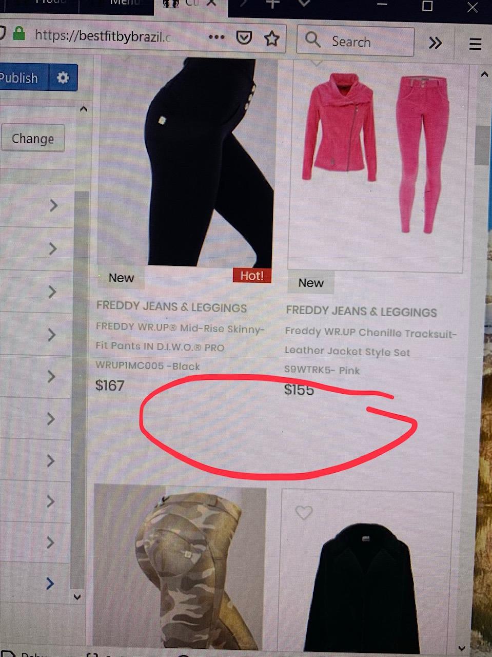
this code just removes space only from very top of products. i need it remove space from rows between products here:

-
September 21, 2019 at 7:32 pm #33732
Please remove code, it will apply for all, it now this affect to js so it add position to other product. Please remove, save and check again. Don’t use browser check
Harry
Premium Wordpress themes and plugins, Best WooCommerce theme https://themeforest.net/user/janstudio/portfolio?ref=janstudio -
September 21, 2019 at 8:06 pm #33733
ok that worked thx!
-
September 22, 2019 at 12:08 pm #33748
So i put this code in css theme to cover mobile and desktop. Not working on either now.
/* adjust space between product rows on mobile */
@media only screen and (max-width: 768px) {
.product {
margin-top: 45px;
}
}and i tried this not working
@media only screen and (max-width: 768px) {
.products.jas-row {
margin-top: 90px;
}}/* adjust space between product rows on desk*/
@media only screen and (min-width: 769px) {
.product {
margin-top: 40px;
}
} -
September 22, 2019 at 2:02 pm #33749
Hi,
The code
@media only screen and (max-width: 768px) {
.products.jas-row {
margin-top: 90px;
}}it work for first row of product on mobile.
Kind regards
Harry
Premium Wordpress themes and plugins, Best WooCommerce theme https://themeforest.net/user/janstudio/portfolio?ref=janstudio
-
-
AuthorPosts
You must be logged in to reply to this topic.
