Forum Replies Created
-
AuthorPosts
-
ok the products flip when you click on them but not open. customer has to click on titles under products in order to open on ipad and mobile devices.
After everything we’ve been doing, I just noticed my wishlist heart on products disappeared. ?? also if you click the product, in the details there is a read button saying “I love it”. where is this coming from? I already have the wishlist heart in the product details next to “add to cart” button
But looks like it works now 🙂 thx!
You gave me this code in last response. what’s different?
@media only screen and (max-width: 1024px) {
.btn-quickview, .product-image a.db::before { display: none;} .product-btn {background: none !important;}
}
we’re getting close. after using your code, it works on ipad until i turn ipad to wide view then same problem. Still seems like some screen sizes are still being affected.
Ok now it seems to happen once you size the screen down to Ipad size. what does the 1024px setting do? it works fine on screens larger than ipad and screens at mobile size. but ipad size screens are still showing the problem.
You can use any computer and any browser to replicate the issue. just drag the screen size down while shop page is open and you will see it happen.
it seems right when the screen has this problem the menu goes to mobile or ipad mode. I guess the size in which this should happen is off as well. customer laptop treats his screen like ipad menu showing menu button on left side instead of full menu on top. and then of course the white film over products happens then too.
Ok here’s what I discovered. It seems to matter what size the screen is if the this white film covers the products. Strange for larger screens no problem, then as i resize the screen the white film appears over the products and then if i shrink even further to mobile size they disappear again. You did something for me a while back in css that helped get rid of this problem with mobile. maybe you can give me some code to avoid this for all screen sizes.
Here’s the video of what I’m talking about.
Attachments:
You must be logged in to view attached files.doesn’t seem to do anything. is the code right?
.product-image a.db::before { display: none;}
i saw it somewhere written like this:
.btn-quickview, .product-image a.db::before { display: none;}
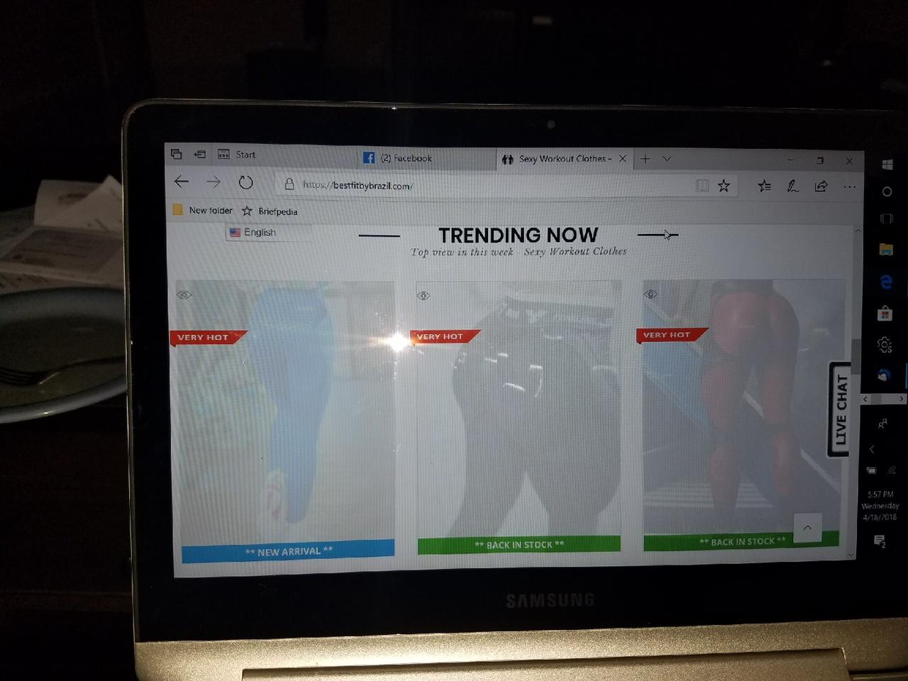
This is still not working. I think you don’t understand the issue. I’ve attached a photo of what happens on some computers, even with the same operating system and version. I thought this was coming from the “quick view” feature, but even if I turn the quick view off, it still doesn’t fix this.
The products on shop pages are completely covered by this white semi-transparent layer. It looks like the quick view has extended to far over the products. Again this only happens on random computers and it doesn’t matter which browser they use. I’m getting more and more calls from customers who can not see the products.
Please help resolve this problem as we are losing customers over this glitch. Here’s what’s happening completely random it seems.

-
AuthorPosts