Forum Replies Created
-
AuthorPosts
-
I did this is what I tried; https://www.youtube.com/watch?v=-MkjQqdgc6U&feature=youtu.be. it gives error

Attachments:
You must be logged in to view attached files.I pasted the link https://youtu.be/-MkjQqdgc6U and i just get black screen when i press button. we don’t use embed code right?
I know you helped me with this before. I need to increase the size of the size swatch circles which made everything move as you can imagine. Can you help me fix this issue and explain to me what is happening so i know how to clear it up myself in the future? thx.
This is what shows when i have product with 2 rows of color options on mobile:
everything looks ok no white space gaps or wrapping

This is what happens when there is 1 row of colors:
Notice 1 small white gap but the size options don’t move which is good. just need to remove white gap

Now look what happens with there are no color options. Huge white gap and size options and size guide button fly up to the photo. eeek looks horrible. Everything seems to shift up when there is no color options. Help… thx.

the slick-slide code seemed to work. not sure what made it stop working. thx.
I think I figured it out. I should just put the html class reference in the “cart” page html element WPBakery Editor correct? https://bestfitbybrazil.com/cart
And the CSS can go in the WPBakery CSS settings Editor of the same page?
no what i’m trying to do is put a “view cart” and “checkout” button on “Single Product Page”. they don’t exist there, and I want to include it in a custom way. So need to create this button so it shows on this type of page ??
DYNAMITE Brazil Leggings L2094 Apple Booty Horus – Sexy Workout Leggings
but don’t we have to declare the button class in html first?
for instance: VIEW CART
the CSS editor will accept HTML? the syntax turns red like it won’t work.
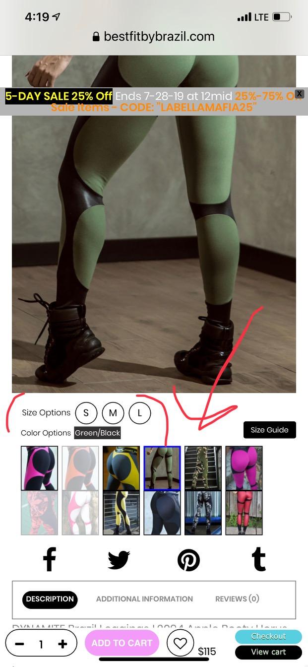
you probably don’t remember but that integrated variation plugin was giving me some issues so i had to get another one. Anyhow let me change the question. This is how mobile view looks when there are colors options:
By the way, the mobile view does not show product thumbnails. i removed that so i can use space for color swatches.
Everything looks ok and in alignment
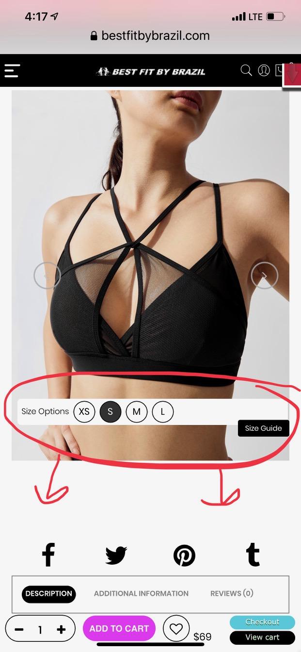
This is what it the mobile view looks like when there are NO color options:
The size chart button moves up and white space containers are left showing space. How to close this space and keep the button relative to the other elements around it?

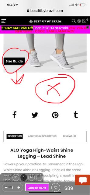
This is how the mobile view looks if i some products have an extra element link to shoes. The size button doesn’t move up with the color swatches so ends up behind them in this case. see the black button behind the first color swatch? That should always stay above the color swatch row.
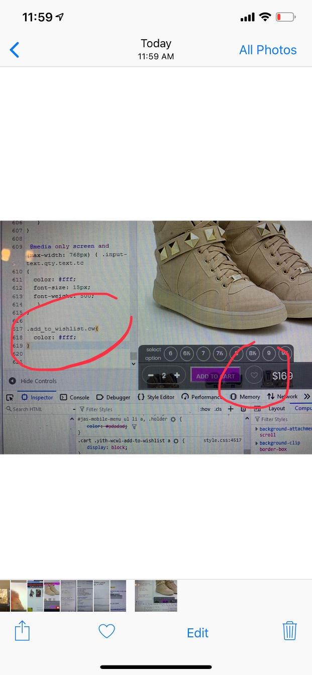
i found a way to select the heart in the center as a separate element and recolor it, but not the circle border around the heart. so it looks ok with that change if you can’t find a way to change border circle to white.
color did not change. still like a gray color.

-
AuthorPosts