Home › Forums › Themes Support › Claue › Change order tracking link and icon my account
- This topic has 9 replies, 2 voices, and was last updated 7 years, 4 months ago by
 Lapetitenovice.
-
AuthorPosts
-
-
February 22, 2019 at 5:16 am #29115
Hello,
I changed the links of the page followed by command so the basic link mysite.com/orders-tracking no longer works how the changed?
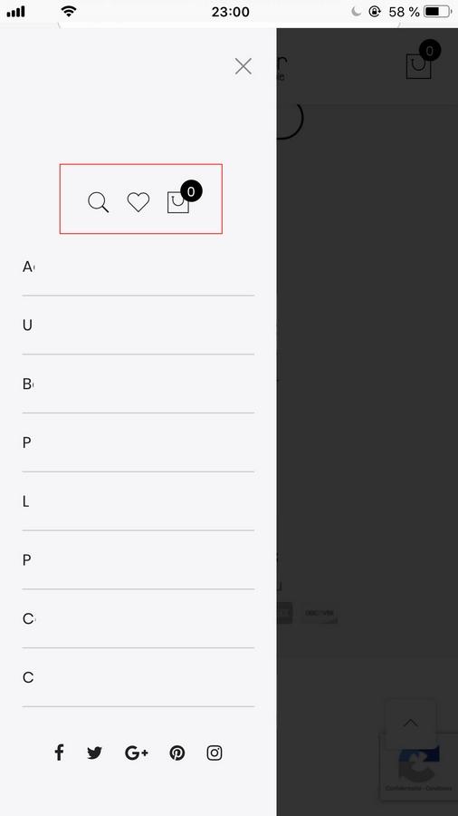
A second question when my site appears on mobile the icon “my account” disaparated from the sidebar, how to put it ?
-
February 22, 2019 at 12:25 pm #29122
Hi,
1. Could you send us your site url add private reply?
2. Please go to Claue > Theme Option > Header > Show account icon > On
Kind regards
Harry
Premium Wordpress themes and plugins, Best WooCommerce theme https://themeforest.net/user/janstudio/portfolio?ref=janstudio -
February 22, 2019 at 2:13 pm #29127This reply has been marked as private.
-
February 22, 2019 at 2:27 pm #29128
2. It’s already done. When the icon appears well in desktop and tablet but not on mobile.
3. Another problem with the configuration shop, I choose a display with 2, 3 or 4 columns systematically it shows me 5 columns while it is not even a possible choice.
-
February 22, 2019 at 4:57 pm #29131This reply has been marked as private.
Harry
Premium Wordpress themes and plugins, Best WooCommerce theme https://themeforest.net/user/janstudio/portfolio?ref=janstudio -
February 23, 2019 at 1:52 pm #29176
Hi, thank you very much for your answers ! Which have virtually solved everything.
3. I spent my day looking more closely at the code I know why I have a problem with the columns of the shop. I changed the % of the columns to widen the widgets in footer which also affected the columns of the shop :
 .jas-col-md-2 {
-ms-flex-preferred-size: 20%;
-webkit-flex-basis: 20%;
flex-basis: 20%;
max-width: 20%;
}
.jas-col-md-3 {
-ms-flex-preferred-size: 20%;
-webkit-flex-basis: 20%;
flex-basis: 20%;
max-width: 20%;
}
I would like to keep this width for widgets in the footer without impacting the columns of the shop. A solution ?
-
February 23, 2019 at 4:39 pm #29185
Hi,
Please add only below code to claue-child > style.css don’t need to copy all code of main theme to child theme.
#jas-footer .jas-col-md-2 {
-ms-flex-preferred-size: 20%;
-webkit-flex-basis: 20%;
flex-basis: 20%;
max-width: 20%;
}
#jas-footer .jas-col-md-3 {
-ms-flex-preferred-size: 20%;
-webkit-flex-basis: 20%;
flex-basis: 20%;
max-width: 20%;
}
Kind regards
Harry
Premium Wordpress themes and plugins, Best WooCommerce theme https://themeforest.net/user/janstudio/portfolio?ref=janstudio -
February 25, 2019 at 2:22 pm #29226
Hi, now the problem of the shop is solved but a new one has just appeared… I really have no luck :’D ! On desktop browsing no worries, on mobile widgets all appear on one line instead of displaying one after the other.
Promised after this problem I do not bother you anymore !
Best regards
-
February 25, 2019 at 5:06 pm #29232
Hi,
Please change code to
@media only screen and (min-width: 736px) {
#jas-footer .jas-col-md-2 {
-ms-flex-preferred-size: 20%;
-webkit-flex-basis: 20%;
flex-basis: 20%;
max-width: 20%;
}
#jas-footer .jas-col-md-3 {
-ms-flex-preferred-size: 20%;
-webkit-flex-basis: 20%;
flex-basis: 20%;
max-width: 20%;
}}
Kind regards
Harry
Premium Wordpress themes and plugins, Best WooCommerce theme https://themeforest.net/user/janstudio/portfolio?ref=janstudio -
February 26, 2019 at 3:22 am #29275
Thank you !
-
-
AuthorPosts
You must be logged in to reply to this topic.