Forum Replies Created
-
AuthorPosts
-
I was able to fix it.
it seems to do this only on fire fox
I made some adjustments. please try now. thx.
what cell phone do you have? what size? i may need to make style adjustments. i always use
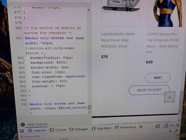
@media only screen and (max-width: 768px) for all devices mobile but not sure if that will look good on smaller devices
Meanwhile what happens if you turn your cellphone sideways so you can see buttons on wider screen?
i think i know why you can’t add to cart. you’re trying to add an item to cart that you have not selected the Attribute “Size” for yet. i’m working on getting the add to cart button to pop this up somehow, but meanwhile watch this video on where to select the size then it will add to cart and not give you a message.
This is what i do to add to cart. try it.
https://www.dropbox.com/s/q6g2yvalvl39bvh/IMG_2334.TRIM.MOV?dl=0
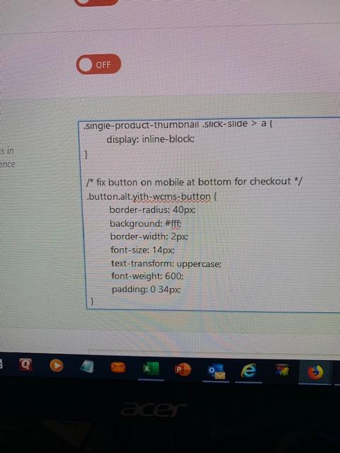
i put code in them area and custom code. i then clear all cache and on mobile it still looks same. Add to cart is working fine. go to checkout to see the button issue.
You are looking at https://bestfitbybrazil.com right?


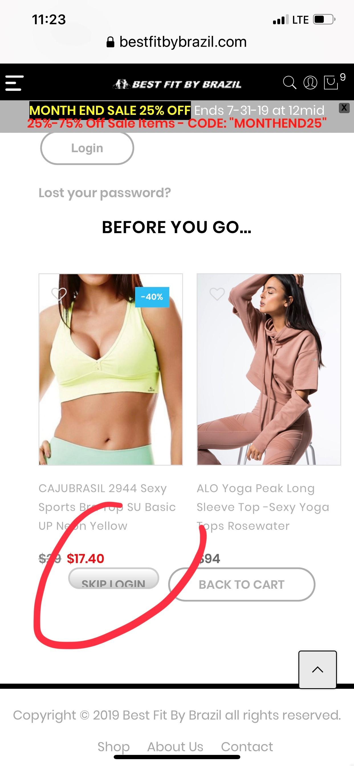
I put the code and it only changed case to capital but look on your mobile device and it will look like this still.

ok great that worked. But here’s another issue i’m having:
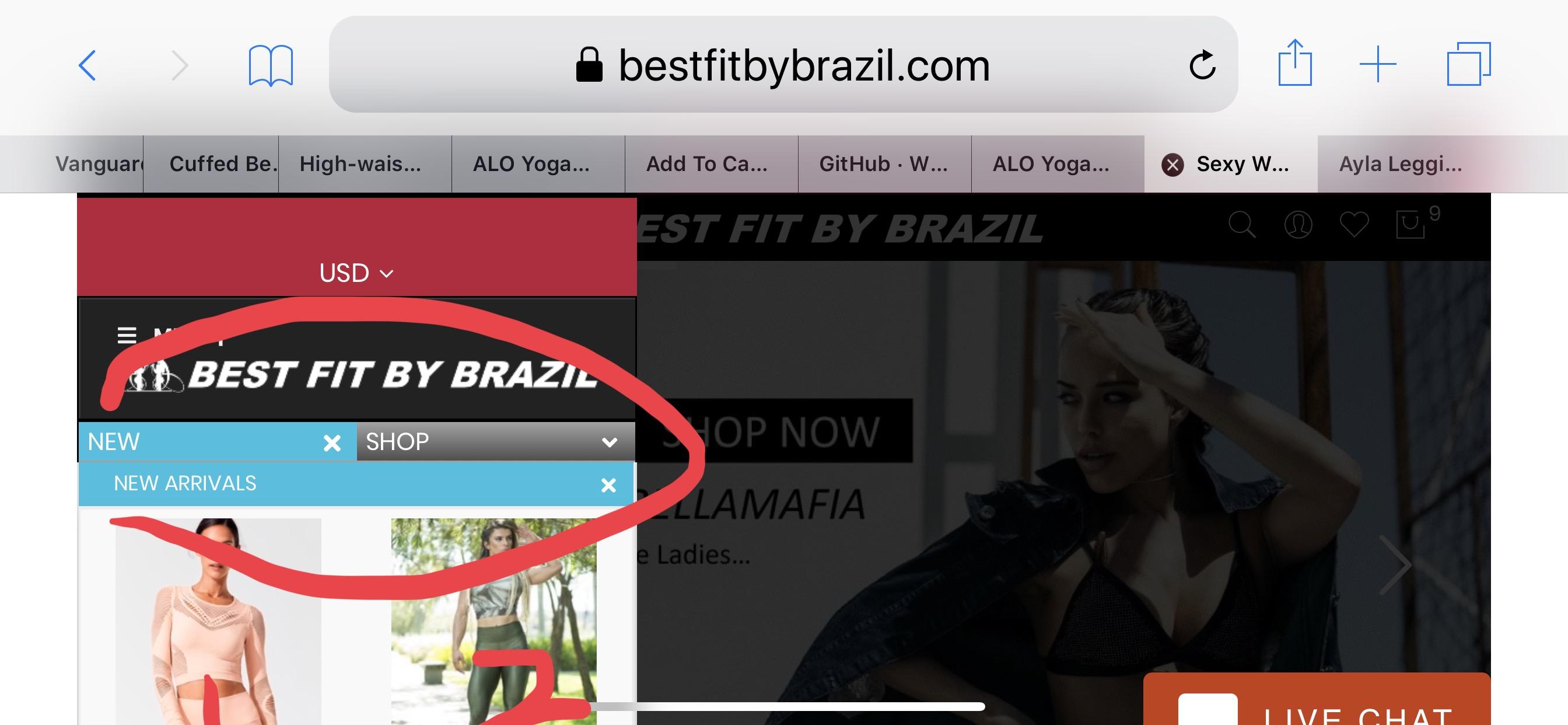
on Mobile when you go to some menu items the images line up top to bottom instead of fitting in 2 columns when photo images are small enough to do so. This is what happens

In this photo, if i turn my cell sideways (landscape) and look at the same size menu, suddenly the menu items split into 2 columns and so do the photo images. I don’t need the menu items to split into 2 columns but the images should do so based on size.

Nevermind. fixed it. wow that was a nightmare to find the right class. 🙂
i was able to move the mini cart menu in front of the elements. but not able to move the elements back. they are to far forward and don’t dim out like the rest of the page when mini cart is enabled.
-
AuthorPosts