Home › Forums › Themes Support › Claue › Mobile menu adjustment
- This topic has 3 replies, 2 voices, and was last updated 4 years, 9 months ago by
 Harry.
-
AuthorPosts
-
-
July 28, 2019 at 8:08 pm #32749
When I tap and slide through mobile menu I noticed the top layer separating from bottom. how to remove this ? See video
https://www.dropbox.com/s/0qwis1iodey6poc/RecordIt-478ED612-9A64-4278-9A91-393EF30E05DA.MP4?dl=0
-
July 28, 2019 at 10:23 pm #32756
Hi,
Please add below code to fix
@media only screen and (max-width: 568px) {
.ubermenu .ubermenu-submenu-grid {
	padding-right: 0;
}}
Kind regards
Harry
Premium Wordpress themes and plugins, Best WooCommerce theme https://themeforest.net/user/janstudio/portfolio?ref=janstudio -
July 29, 2019 at 12:37 am #32757
ok great that worked. But here’s another issue i’m having:
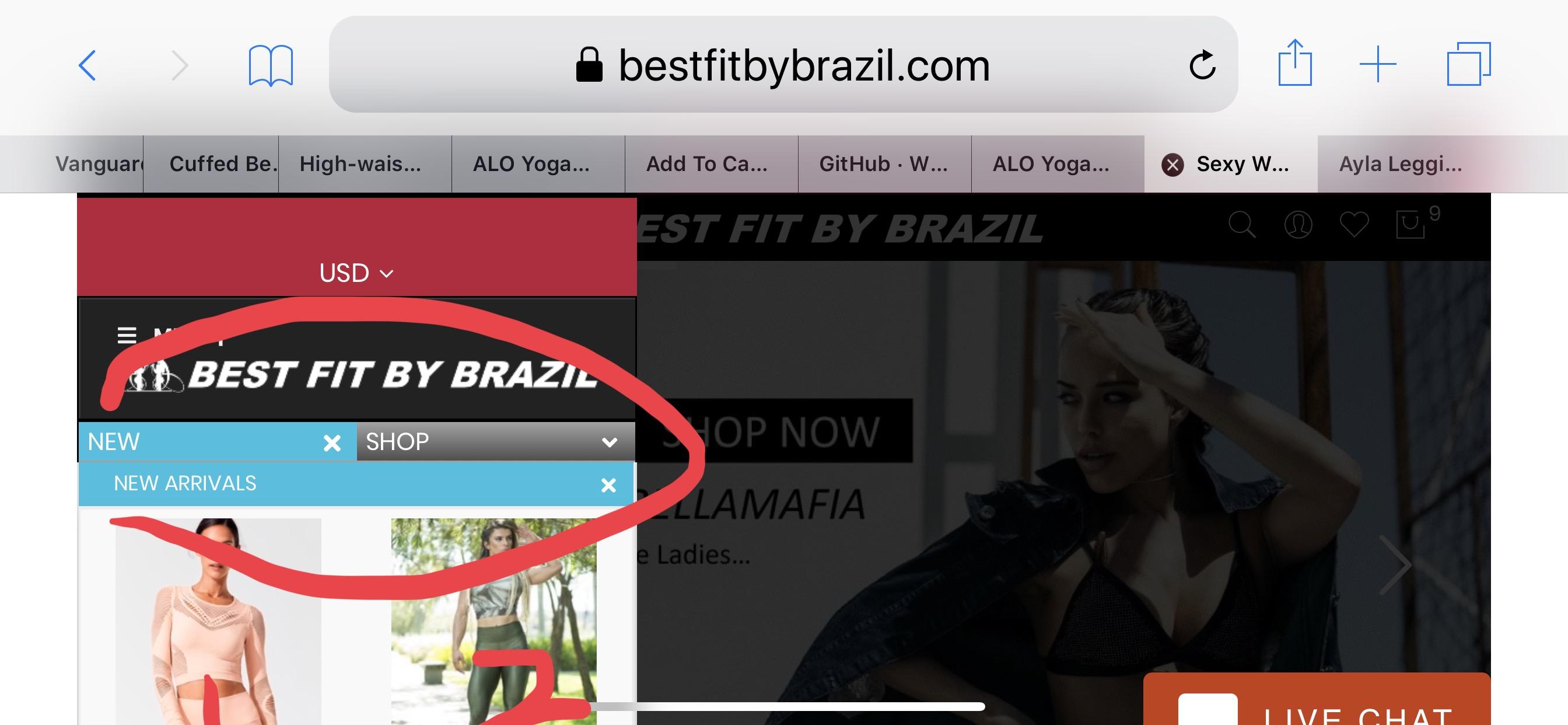
on Mobile when you go to some menu items the images line up top to bottom instead of fitting in 2 columns when photo images are small enough to do so. This is what happens

In this photo, if i turn my cell sideways (landscape) and look at the same size menu, suddenly the menu items split into 2 columns and so do the photo images. I don’t need the menu items to split into 2 columns but the images should do so based on size.

-
July 29, 2019 at 5:43 pm #32767
Hi,
For this case, please contact to plugin author “UberMenu”
Kind regards
Harry
Premium Wordpress themes and plugins, Best WooCommerce theme https://themeforest.net/user/janstudio/portfolio?ref=janstudio
-
-
AuthorPosts
You must be logged in to reply to this topic.