-
Search Results
-
Topic: Help with shop/page -filter
My filter dont get the same format as the demo site
Do i need to add som css or am i missing something?(Web url: demo.lorange.no)
Hi.
I buy a licence the request a quote plugin, again, and I have a problem, again, like before.
The botton of the plugin, isnot apear in front in all page , shop , category, etc. Apear only in the single product page.Some time before, you can resolve this, with a css code insert in the adicional css option:
“Whenever you need to show the add to quote button on a custom page or in a specific place of the page, you can rely on this shortcode: [yith_ywraq_button_quote] “.
If posivel, send me to de ccs code, to add too the mini quote cart :“The following shortcode lets you add the mini cart widget anywhere on your site where you can enter some text:[yith_ywraq_mini_widget_quote] “.
I atach a 2 files to see more a less like should be. Its more easy to customer make a choice and maker quotes .
We dont sale diretly by the web, is to danger.I hope you can help me in a soon time, and I create a user and password to you if need acess the site.
Feliz ano novo 2023. Happy New year 2023 and many great big and good moment to the future.
Esteban - indiafactorybr.com.br
In Mobile Device One Item Per Row Requires. Currently it is showing two item per row. Where i change setting or send me css if any for this
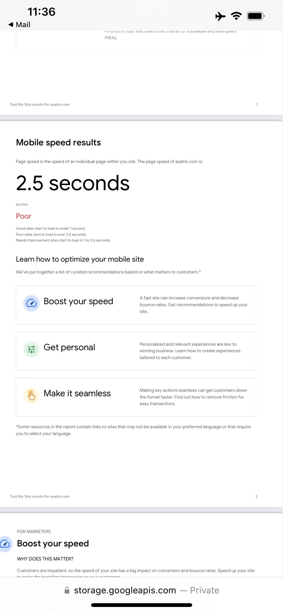
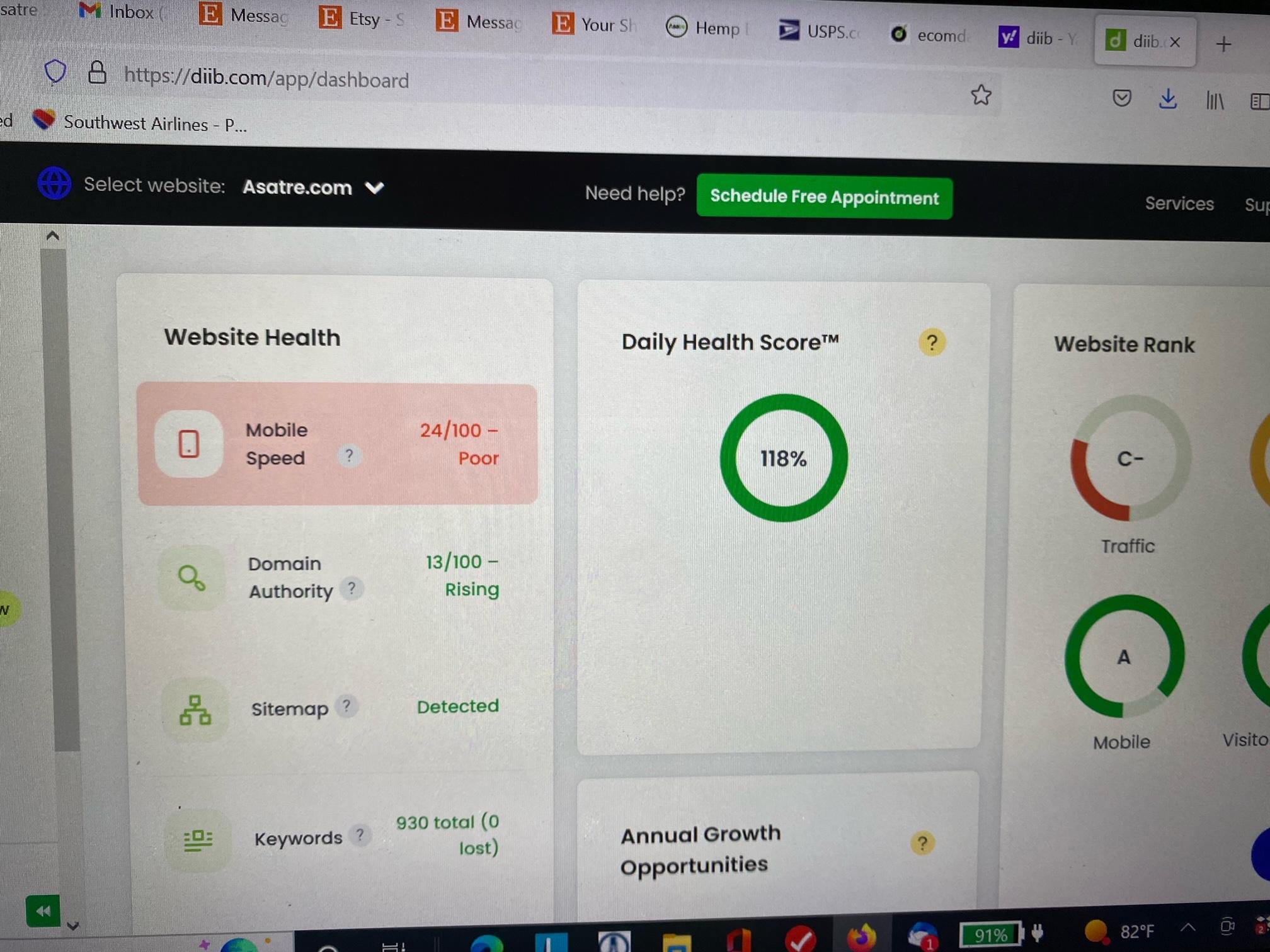
Topic: Poor Mobile Site Performance
Since the very beginning, mobile performance is poor and is now a major problem for our SEO. We have tried multiple caching plugins without helping. We also tried minifying CSS, java script, etc with numerous plugins but that breaks the site. Our developer is recommending changing templates. Can you resolve mobile performance issues with the Claue template?
Asatre.com ID=clauesupport PW=ClaueSupport2022#
Support Forum
We will do our best to assist you with any issues related to our themes and plugins.
Response time up to 1-2 business days.
Our timezone:5:07 PM
Your timezone: